Showing posts with label Magazine. Show all posts

Friday, 6 February 2015

Finished Magazine Front Cover - Annotations

Below is my final edit of my Gossip Magazine Front Cover.

Below I have annotated my front cover.

Here is a link to the post on my demographic research.

Friday, 12 December 2014

Editing of my final model photos

My previous post included the final photos I took of my model Cal for my magazine front cover. Conventionally, photographs that are used in magazines are highly edited, especially those of models used on the front cover. I wanted my gossip magazine to be conventional looking, and so planned to edit the photos of Cal. I found 3 editors I could use, Photoshop, the most popular of the 3, PicMonkey.com  being the editor I am most familiar with and Pixlr Editor on my Google drive which is a new find.
PicMonkey is the editor I'm most comfortable with, I find Photoshop hard to use and as it's costly to download I can only access it from home, meaning I'll have less time practicing on the application. Not only this but PicMonkey is very similar to Photoshop, if not better as it has so many more filters. However, there is one minor problem with PicMonkey, which is that it's only accessibly within school on Mac computers. This is only a minor problem as I can use PicMonkey at home and I'm not pushed for time, so this is what I'll do.
However, Photoshop is the conventional application to edit photos on, and I believe gossip magazine companies use Photoshop rather than PicMonkey.com, and so, I tried to edit a picture on Photoshop to practice. The main things I need to do to the image to make it more conventional for a magazine front cover is to:
  • Blur or change the background colour
  • Crop the image so the aspect ratio is that of an A4 sheet of paper, which is width 210 cm and height 297 on Photoshop
  • Enhance Cal's eyes, making them brighter, as it makes his eye contact the vocal point, This eye contact is good as it makes the consumer feel more connected to the celebrity or model, and so would rather buy it.
  • Airbrush Cal's skin. This is a conventional editing technique of any image within the media, this won't change my image too much as Cal's skin is clear and looks fine, however I want my image to look conventional.
  • Enhance the contrast of the image, making it brighter.
I edited one of the photos of Cal on Photoshop and did as many steps, as listed above, as I could within the application. The final edited image is below:
On this image I was able to:
  • Change the background colour, so it looks more professional and so Cal is the main focus.
  • Crop the image to the right aspect, of an A4 magazine sheet of paper.
  • And adjust the contrast making the image overall, look better.
  • Blur Cal's face, as if it were airbrushed.
On Photoshop I couldn't enhance Cal's eyes, however when looking on my Google Drive, at the Pixlr Editor, I found a method of doing so. Below is the image, the left eye has been edited, and looks brighter and stands out,

After editing the image, I still believe PicMonkey is a better editor, and so I will be using it to edit the image, and create the magazine front cover. As I have to do this step at home, I will upload the picture later. 

As conventionally, the model for the front cover of a magazine, especially a Gossip magazine, must be highly "Photoshopped", I'll be editing the picture of Cal highly. The first change will be brightening his eyes on My Google Drive, Pixlr Editor

Above is the evidence for this edit. I used the Dodge tool on "Highlights", which exaggerated the highlighted tones, making Cal's eyes look brighter and stand out. This emphasizes the fact he has eye contact with the reader/audience/consumer, and so they are more likely to choose this magazine as they feel connected to the magazine.


The next step has been screenshot and is shown above. I darkened Cal's eyes using the Burn tool on "Shadows", which increased the intensity of the shadows around Cal's eyes. Again, this makes Cal's eyes stand out, but it also looks as though Cal may have mascara on, which would be conventional for a model.


The next step, shown above, was to remove any moles on Cal's face and arms using the Spot Heal tool. This is another conventional step the editor of a magazine would do to a picture of the model. Moles are perfectly natural, however they are never seen on magazine covers as they are seen as being "imperfections". 


My final step, shown above, was to increase the size of Cal's arms muscles. I used the Bloat tool on his upper arms. I chose to do this as conventionally male models will have a high amount of muscle, and by increasing the look of the size of his arms, Cal looks more muscly and therefore will be more appealing to the magazines target market, which are women.


Thursday, 11 December 2014

Final Model Pictures - Magazine Front Cover

Today I retook the pictures of my model Cal for my magazine front cover. The reason behind recapturing them was because I felt the quality of the first pictures weren't of the best quality, but I had a camera that would take better photos, and so brought it in to take photos in the school's photography studio. Also, the white background blended in with Cal's clothing when editing so we changed the background to black. As you can see, I tried with the white background, however the black sheet does look better. Below are the images, unedited. As I had taken shots of several different poses previously, I decided on a pose which I thought was best fitted, which is the reason for all photos taken below being of the same pose.


I used the browser editor, PicMonkey.com to make a slight edit to the picture. I cropped the image, used auto enhance, increased the contrast, blurred the background, and boosted the eyes, to make his face and eyes clear.
Final photo edit. To make this edit better, I want to make the black background darker and blur it out more, so the creases aren't visible.

Steps of editing, on PicMonkey.com

Here I am "boosting" the eyes to make them look brighter, and bolder, so they stand out on the front cover. This will emphasise the eye contact from the model, which conventionally is used on magazine front covers as the eye contact makes the model look more welcoming for the audience.


In this screenshot you can see I have "softened" the whole image but am in the process of removing this blur on Cal. By having a blurred background, the main focus is Cal. This blur will also make the background look less like a sheet.

Wednesday, 10 December 2014

Gossip Magazine Front Cover - 1st draft

To the left is my first creation of my gossip magazine front cover. Overall, it looks very conventional, but it isn't completely finished and there are some small things I could change. I wanted to try creating a front cover before my final, as using Photoshop is not a strong skill of mine. Ideally I would of wanted to use the browser editor, PicMonkey.com, as I'm very comfortable with this website and it's a very professional looking editor, however on some of the school computers the website is blocked. As it was a first draft, using Photoshop was more beneficial as it gave me a better understanding of Photoshop, which in the future will be beneficial for me. After creating this on Photoshop, I feel a lot more comfortable on Photoshop.
This front cover is only missing one thing; a close up picture of me, as the actress in the film I'm creating for my teaser trailer, as the article on the front cover is used to advertise the movie.


Thursday, 4 December 2014

First Model Pictures - Magazine Front Cover

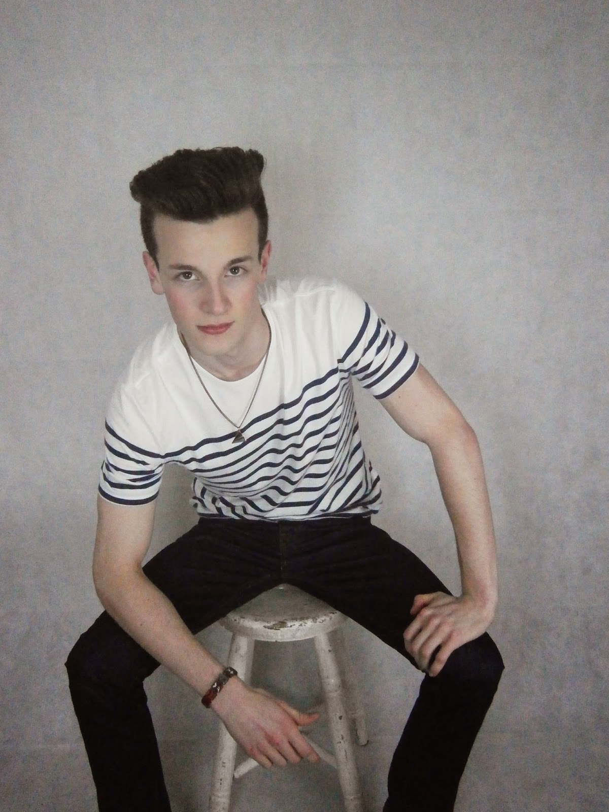
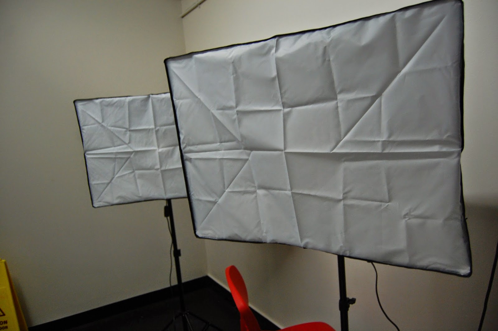
In the photography studio I shot photos of my model Cal. We chose the studio as it has professional lighting and a white background.
Here are the original shots


These first 3 pictures are effective for a magazine front cover as the width of Cal is rather narrow, and so can be placed on the front cover of a magazine with article around the outside, and still fit. Cal also looks strong and professional, which consequently makes him look older than a student, and so is more believable to be the model for a magazine front cover. I think although these were the first poses I asked Cal to make, I think they are the most aesthetically pleasing for a magazine front cover, mainly due to his front facing profile, and so I'd like to use these poses for my final shots, however I will make Cal smile slightly, like in the first and second picture, rather than making him completely straight faced, as in the third picture.


In the first 2 pictures, I directed Cal to have a neutral face, but for these 2 pictures I wanted to try a more welcoming face by making him smile. I quite like these photos as, along with the eye contact, overall I think the audience will find these aesthetically pleasing too. However, I think for my final magazine front cover I will choose a picture of Cal with a more neutral face, as it makes him look older, more professional rather than childish, and is more conventional, as more examples of magazines have neutral faced models.


The photos above I wanted to make a dramatic change of the pose, by making Cal bend down. Although the pictures look professional and more creative, it may be hard to shape the articles and other text of the magazine front cover around Cal's profile.
Overall, I like the variety of poses I shot and directed of Cal, and I am happy with what I will choose for my final pictures.

As said before, I chose to use the photography studio as the location for Cal's photo shoot. The lighting and plain background both gave a clear, professional looking photo. With some editing, I believe my final pictures will look as professional as those published onto a real magazine, and the equipment in the photography studio helped make this happen. Below I took some location shots so the set is clear for you to see, with the studio lights and sheet background.


Although I like the poses, lighting and set up here, the picture quality is not the best, as I used a school camera, which although is sufficient, I feel it could be better. As I have a better quality camera at home, pictured to the left, I am going to use this camera for my final pictures.


Also, as the background is white, and so is Cal's shirt, when editing on Photoshop it is hard to use the Magic Wand or Quick Selection tools to remove the background to make it transparent, as the white shirt blends in with the background.
As this was a problem, for the shooting I'll be doing tomorrow, I told Cal to wear a dark top, but with neutral colours again, to make it easier to edit.


Magazine Front Cover Planning Primary Steps

The size of a magazine is conventionally the size of an A4 size piece of paper. Photoshop has a default size for A4 and so I can use this.
I will be using my previous post, What is a Gossip Magazine? post, in which I found the typical conventions of a gossip magazine, to help create a first production of my own magazine front cover.

I now have to create a title for my magazine, I've found popular gossip magazines use titles that are just one word, short and snappy, as they're easy to remember. My magazine will be called "Happy", as it gives a positive idea of the magazine, but is also memorable as it's short.
Front my post mentioned before, I found a convention of the title is that not only must it be a one short word, but aesthetically, the font must be bold and unique, the size must be large, and it must be at the top / top left of the page, as in the Western world we read left to right. 
To find an acceptable font, I looked on DaFont.com. The sections I looked at were: Comic and Sans Serif as the fonts under these sections were all bold and easy to read, which is ideal. Here are some examples of the font I may choose:
 

All fonts are bold and easy to read, as they are catergorised as sans. The picture to the left is of Sans while the picture on the right is of fonts that are under the Comic genre. I prefer the fonts that are genred as "sans" as they're bold and are more sophisticated, the "comic" fonts may look too childish. However, I want my font to have a shadow, like the example on the right picture. DaFont.com gave me some good ideas. For the colour of the font, I would choose a shade of pink or red. Gossip magazines are aimed at women and so will the magazine that I create, generally women are associated with the colour pink or red as they're known as "romantic" "girly" shades and so I think if my font were to be a shade of these colours they'd be more aesthetically pleasing for my female target audience. I would like my slogan to be "Social news that makes you smile", as it links with the positivity of the title but also integrates social news as that what gossip magazines include.

Wednesday, 19 November 2014

Magazine Demographics

When searching in Google "Most popular gossip magazines UK" the search result was:
Now
OK
Heat World

I then used the website YouGov, which shows profiles of media products, such as magazines, films, bands, and the demographic of the average person who likes it. I searched the demographics for each gossip magazine that I found was most popular in the UK, so my results would be my most common target audience. Below are the screen shots...

NOW magazine demographics 


OK magazine demographics


HEAT magazine demographics


Result analysis:

I am overall very happy with the information I have found, the demographics were similar for each magazine, which will create a strong target audience for me to follow. Also, the sample size for each demographic is extremely high, over 1000 for each, and the size is shown on the screenshots. This will mean my findings are much more reliable.