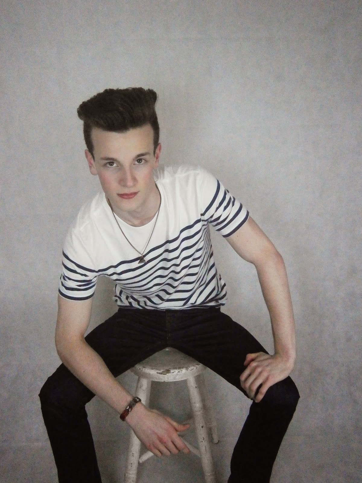
Here are the original shots
These first 3 pictures are effective for a magazine front cover as the width of Cal is rather narrow, and so can be placed on the front cover of a magazine with article around the outside, and still fit. Cal also looks strong and professional, which consequently makes him look older than a student, and so is more believable to be the model for a magazine front cover. I think although these were the first poses I asked Cal to make, I think they are the most aesthetically pleasing for a magazine front cover, mainly due to his front facing profile, and so I'd like to use these poses for my final shots, however I will make Cal smile slightly, like in the first and second picture, rather than making him completely straight faced, as in the third picture.
In the first 2 pictures, I directed Cal to have a neutral face, but for these 2 pictures I wanted to try a more welcoming face by making him smile. I quite like these photos as, along with the eye contact, overall I think the audience will find these aesthetically pleasing too. However, I think for my final magazine front cover I will choose a picture of Cal with a more neutral face, as it makes him look older, more professional rather than childish, and is more conventional, as more examples of magazines have neutral faced models.
The photos above I wanted to make a dramatic change of the pose, by making Cal bend down. Although the pictures look professional and more creative, it may be hard to shape the articles and other text of the magazine front cover around Cal's profile.
Overall, I like the variety of poses I shot and directed of Cal, and I am happy with what I will choose for my final pictures.
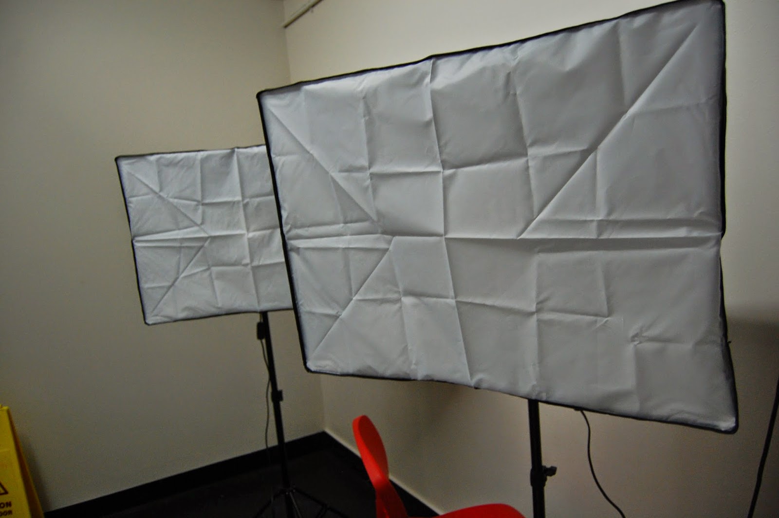
As said before, I chose to use the photography studio as the location for Cal's photo shoot. The lighting and plain background both gave a clear, professional looking photo. With some editing, I believe my final pictures will look as professional as those published onto a real magazine, and the equipment in the photography studio helped make this happen. Below I took some location shots so the set is clear for you to see, with the studio lights and sheet background.
 Although I like the poses, lighting and set up here, the picture quality is not the best, as I used a school camera, which although is sufficient, I feel it could be better. As I have a better quality camera at home, pictured to the left, I am going to use this camera for my final pictures.
Also, as the background is white, and so is Cal's shirt, when editing on Photoshop it is hard to use the Magic Wand or Quick Selection tools to remove the background to make it transparent, as the white shirt blends in with the background.
As this was a problem, for the shooting I'll be doing tomorrow, I told Cal to wear a dark top, but with neutral colours again, to make it easier to edit.


No comments:
Post a Comment